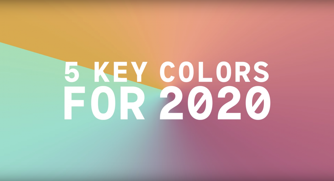
Whether you’re a home decorating aficionado or you rely on interior design to make a living, it’s important to keep ahead of the curve when it comes to colours and trends.
You won’t want to be the last person to get the memo when it comes to what’s in style and what’s passé. That’s why the industry is already looking ahead to spring and summer 2020 and preparing for the next big thing.
Today, we’re going to look at five different colours that will make a big impact next year. We’re using information provided by WGSN, a trend forecasting and analytics company and their sister company, Coloro.
You’ll probably notice a few of these colours creep into magazines, high street shops and social media accounts as we approach the end of 2019 – let your friends and family think you’re a trendsetter by using them in your home now.
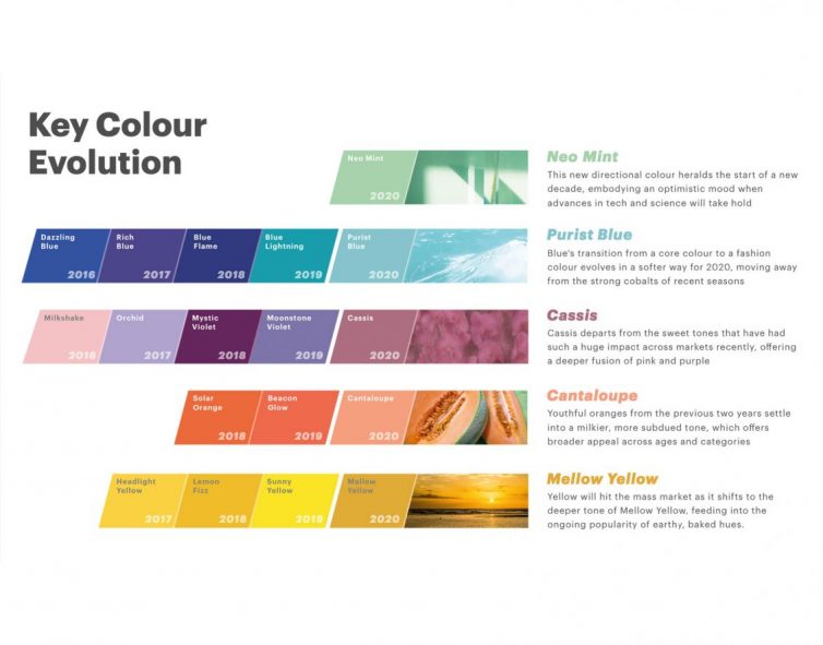
Colour #1 – Mellow Yellow
Yellow’s spent several years increasing in popularity, largely thanks to GenZ and associations with their well-loved brands and influencers, including the Snapchat and Bumble logos, Beyonce’s now infamous dress and Selena Gomez’s iconic photoshoot.
In 2020, our love of yellow will peak, but it’s a deeper tone that will appeal to the masses. Mellow Yellow is upbeat, substantial and versatile. It will hold its own throughout spring and summer 2020 and take us into the autumn.
Mellow Yellow follows on from the sunbaked, earthy shades that dominated much of summer 2019.
Using Mellow Yellow in your home: Use splashes of this gorgeous shade as an accent colour in your home decor. It’ll work beautifully with cream, light grey and cantaloupe (below) if you’re hoping to create a fresh look.
Colour #2 – Cantaloupe
Neon coral and bright orange had their moments in 2019, but 2020 will bring a milkier, subdued and feminine take on the shade. Juicy cantaloupe draws inspiration from nature. It’s nurturing, soft and sweet. According to WGSN, Cantaloupe radiates “an upbeat quality that is perfect for high summer”.
Using Cantaloupe in your home: Use this pretty shade to brighten any room in your home. A sofa in this colour would make a real impact in your living room.
Colour #3 – Cassis
Cassis is the perfect shade of purple, drawn straight from nature. Think freshly crushed blackcurrants and deep, rich aubergine skins. It’s elegant and understated with a moody twist. Looking for a gender-neutral shade that is modern and youthful? Cassis is your colour.
Using Cassis in your home: Do you dare to paint your walls in this rich, decadent shade? We hope so. But if the answer is no, use it in your furnishings instead. It’ll look fantastic paired with a dash of Mellow Yellow.
Colour #4 – Purist Blue
Purist continues the ‘under the sea’ / ‘ocean-inspired’ trend that emerged in 2019. Except, it’ll feel softer, sunnier cooler, crisper and more contemporary shade than the shades of blue that came before.
Using Purist Blue in your home: Make Purist the hero of your room by pairing it with a cool white. Perhaps use the shade to create a calming space to sit and reflect.
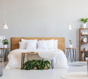
Colour #5 – Neo Mint
WGSN hail neo-mint as the ‘new story’ for 2020. The soft-yet-tangy colour evolves from the popularity of the soft pastels that dominated the twenty-tens (remember Millennial Pink?) but it nods towards the new, modern decade. It is the perfect marriage between science, technology and nature – three areas that will be in focus during 2020 and beyond.
Maintaining its crisp appearance, Neo Mint [is a] light tone which can be used as a contemporary alternative to grey. WGSN.
Using Neo-Mint in your Home: The bold and brave will let this shade command the room. Choose a large, showstopping rug in this colour or look for wallpaper with neo-mint detailing.


