
Earlier this month, Farrow & Ball announced an exciting collaboration with the Natural History Museum.
Together, the two organisations have released 16 new shades of paint in an exclusive collection named “Colour by Nature“.
Here’s how Farrow & Ball describe the collaboration on their website:
Bring the true colours of nature into your home with Colour by Nature, a palette of rich jewel tones and earthy hues. Created in collaboration with the Natural History Museum and drawn directly from the original classification of colour in nature. — Farrow & Ball

Of course, Farrow & Ball are British paint manufacturing giants known for their carefully curated catalogue of 132 unique colours, many extracted from historic palettes and National Trust archives. This metliculous research has provided some of the company’s most iconic and best-loved shades. The latest collaboration with the Natural History Museum does not deviate from this process. Farrow & Ball used the London-based museum’s world-leading collection as inspiration for this project.

It was one of the museum’s books that provided most of the source material:
[the new collection] looks back more than 200 years, and is inspired by entries in Werner’s Nomenclature of Colours – an 1814 classification of colour in nature that was used heavily by scientists and artists of the time. Werner once aided a young Charles Darwin on his voyage aboard HMS Beagle, and an edition of this famous [tome] now resides in the Museum’s rare book library. — Homesandgardens.com

Each new F&B hue has its origins in the natural world. Inspiration comes from precious gemstones, flower petals, insect wings and bird plumage.

An assortment of soft neutral colours complement the collection’s vibrant jewel tones and muted earthy shades.

The 16 new colours have some serious green credentials too as Farrow & Ball continue their promise to be kinder to our planet. All of the company’s paints are blended with an eco-friendly water base, come in an infinitely recyclable tin and are low in VOC compounds ensuring better indoor air quality and less pollution. They’re also child-friendly.

Ready to explore the exciting new collection? Here are some of our favourites:
Ultra Marine Blue
You’d find this mid-toned blue on the upper side of the wings of a small blue Heath Butterfly or in a Lapis Lazuli stone. It has a slightly romantic feel.

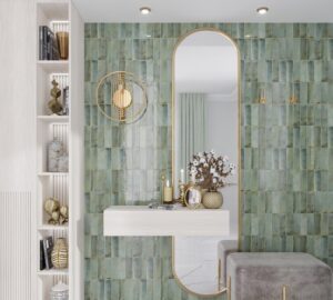
Verdigris Green
Named after ‘verdigris’, the green patina that forms naturally on copper and bronze. You’ll also find it on the tail of a long-tailed Green Parrot. It’s a lively, vibrant shade.

Imperial Purple
Inspired by the deepest parts of the Saffron Crocus flower and dark purple crystals found in some variations of fluorite gemstones, this shade of purple is rich and luxurious.

Lake Red
This showstopping shade is neither red nor pink. You’ll find it in a cheery bunch of tulips, a shrub of apothecary’s roses or the glisten of a spinel gemstone. It’s both happy and warm.

Dutch Orange
This clean, bright and dynamic shade is a breath of fresh air. Spot it in the feathers of a Golden crested Wren, in the petals of a common marigold or in a streak of the orpiment mineral.

Crimson Red
Find this deep, warm pink in the precious garnet gemstone. It’s soft and inviting on its own, but paired with darker tones it really comes to life.

Which is your favourite? Share your thoughts below!


