
Taste is a funny old thing. Although it is certainly true that people can have “similar” tastes, it is plainly impossible for any two individuals to have identical tastes. Surely, there are as many individual tastes as there are individuals!
This is all well and good if you live alone. You will be completely free to display your world-record-breaking china doll collection or paint your kitchen walls black, should you so desire. However, if you share your living space with others, then some compromises will doubtlessly need to be made.
So, is it actually possible to make these compromises AND achieve a perfect colour scheme for the heart of your home – the living room? We believe it is. Whether you are simply redecorating, planning a major redesign, or have just moved into a new home, there are many things to consider before splashing out on the paint and donning those snazzy overalls.
So, put the kettle on (or open a nice bottle of red), sit down with your nearest and dearest, then read on to discover the key factors you will need to take into account in the planning stage, before you spend so much as a penny, and before you lift so much as a little finger. Who knows – you might enjoy the process so much that a career in interior design could be beckoning!
Mood

One of the first things to reach an agreement on is what sort of mood and ambience you would prefer the living space to exude. For this, consider the purpose and role of the room, and think about the kind of atmosphere that would most lend itself to the activities that will take place there.
For instance, will someone be working from home in your living room during daylight hours, or will you all be using the room mostly in the evenings? Will you be using the room solely for watching television, reading and socialising, or will you also be using it for dining and indulging in your hobbies? And – related to the previous question – do you want to feel relaxed or energised in this space? If you want to feel both of these things at different times, then your colour scheme will need to take this into account.
Generally speaking, subtle tones such as refreshing light blues, soft greys and cool violets tend to be relaxing and soothing, and muted greens can emit a sense of wellbeing as they tend to create a calming, peaceful effect. For energising a room, go for bold splashes of bright yellows and oranges to lift the mood and enhance creativity, but take care not to overdo it. Ensure that bolder colours are relieved by neutral colours such as creams or beiges to prevent over-stimulation, which can become exhausting – and therefore counter-productive – over time.
Tone & Character

Again, tone and character are very much a matter of personal taste, and there is a very wide spectrum of possibilities here. Some people prefer to live in a minimalist way with nothing on display apart from entirely essential, functional items that are in use every day. This can lend the living space a more functional, uniform, and disciplined character.
Some people choose to collect objects, ornaments, and other paraphernalia which they choose – consciously or otherwise – to display in their homes. This can make a room feel cluttered if overdone, but can also add an element of interest and colourful personality.
Many people opt for a particular theme – for example, a specific historical period, or perhaps a tribute to something they are passionate about (e.g. their favourite author, TV show, sporting team or artist) which will, to a large degree, dictate their choice of furnishings and colour schemes.
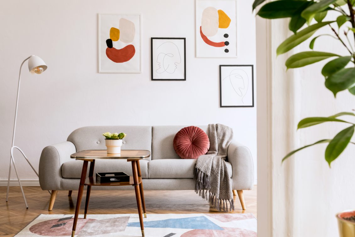
If you’re keen to create a modern contemporary feel for your living room, choose subtle, neutral, muted shades such as soft greys and light natural browns as your dominant colours. This will create a sense of calm, and will also allow for personal touches to be added. Darker shades of your dominant base colours make a complementary secondary choice for carpets, feature walls, soft furnishings and furniture. If desired, you could also add a brighter, more intense colour as an accent here and there.
For a more formal, traditional living room design, choose deeper shades of classic colours such as huntsman green, bone china blue or royal blue against neutral colours such as antique white, vintage ivory or pearl for a touch of class. You could also include a rich accent colour such as a burgundy wine or regal purple.
Of course, many people prefer to combine both contemporary and traditional styles for a more customised personal effect. In this case, more contemporary neutral shades such as magnolia or stone grey can be paired with rich hues such as navy blue or maroon.
It is important to consider the character, tone, and mood you wish to create in a holistic manner before deciding on your colour scheme, as each of these factors need to work in harmony with each other. If you’re struggling to find a happy medium or you can’t decide which colours would work best for your needs, then it might be worth hiring an interior designer to bring some inspiration and expertise to your project.
Climate
It is also a good idea to take into account the climate of your home’s environment. For example, if you live somewhere with year-round higher temperatures, then you will most likely want your living space to feel cooler, whereas if your home is located in a country with a colder climate, you may prefer to create a cosy, glowing atmosphere in your living space with warm deep reds, darker yellows, bronzes, golds and burnt oranges.
If you live in a place where the climate has distinct seasons, then you will need to think about ways you can make your living space appear cool enough in the summer, and warm and cosy enough for winter evenings, without being too dark during the daytime. For example, combining earthy brown tones and neutral shades such as cream with a few splashes of rust-reds or burnt oranges can create warmth in the living space, but will also be light enough for the extended daylight hours during the summer months.
Lighting
The type and amount of light in the room is a crucial consideration when deciding on a colour scheme for your living space.
First, you will need to think about natural light. Several factors affect how much natural light can enter a room. For instance, the number, size and positioning of windows, whether your room is on the ground floor or an upper floor, and the direction in which the building is facing all need to be taken into account.
If your living space allows in a great deal of sunlight, then darker, earthy hues complemented by brighter, sparkling jewel tones such as emerald green, sapphire blue or amethyst purple can work really well. The brighter colours will catch and reflect the sunlight, creating a pleasing dappled effect on your walls. Bear in mind, however, that wallpaper is likely to fade in rooms with lots of natural light, so you may want to consider painting your walls in complementary colours instead.
For darker rooms with very little natural light, it’s best to go with sunny colours to make your living space appear lighter and brighter. Lots of cream, ivory, white, buttercup yellow, pastel greens, and powder blues can all help to make a darker living space feel more cheery.
You will also need to consider your artificial lighting plan. This will almost always involve combining multiple light sources to create the desired effect. Most people use their living rooms as a multi-functional space, so it stands to reason that different types of lighting will be needed in different areas of the room, depending on the primary activities each space will be used for.
When deciding on lighting for your living space, you will need to think about any potential glare and shadows, as well as brightness, contrast and temperature (warm or cold lighting), all of which will impact how your lighting will work with the colour scheme you have chosen.
For example, ceiling lights tend to be brighter with a colder, starker light, and are necessary when partaking in activities that require you to see the whole room clearly. Smaller desk lamps can be positioned close to seating areas where you may need additional light for reading, sewing, eating, working or carrying out hobbies. Indirect wall lighting can create a cosy atmosphere when relaxing and socialising or watching TV, particularly if your wall lights have an integrated dimmer switch to control the level of light according to mood. Spotlights can frame objects you may want to emphasise such as your favourite paintings or an item of beautiful furniture.
For a warm and inviting living room, it’s often a good idea to use lower wattage indirect lighting. Indirect lighting means that the light source isn’t visible. This can be achieved by placing lights inside alcoves, behind furniture, or by angling wall lights upwards, which enables the light to be reflected against the wall and dispersed in several directions for a softer effect.
If you’re going for a really cosy atmosphere, you may wish to consider coloured lighting or fairy lights to add some warm hues and make your room more homely. Well positioned table lamps and floor lamps with colourful lampshades will also dampen down the temperature and brightness of your lighting for an inviting and more intimate effect.
The types of light bulbs you choose will greatly impact on how your chosen colour scheme appears. For example, halogen lights are almost white, and the closest you can get to natural daylight, whereas fluorescent lighting is bluish and incandescent lighting has a yellowish hue.
Yellowish light tends to intensify warm colours such as reds, yellows and oranges whilst muting cooler tones, whereas bluish light works better with cool blues, greens and violets. Colour intensity is also affected by the amount of light. Dim lighting makes colours seem darker and less intense, whereas brighter lighting increases the intensity.
Room Size
Whoever said size doesn’t matter could not have been in the midst of choosing a colour scheme for their living room at the time. Clever use of colour can totally transform how big or small a room will appear.
Of course, most people instinctively realise that it is best to go with light colours in a small room when decorating a space to make it seem bigger, rather than even smaller. Light, bright colours which reflect the light can really open up a space. Go for white, cream, ivory or beige as your base and add richer splashes of colour to enhance, break up, and add accents to these neutral shades. Cool pastel hues can also work well in a smaller space, but may not make enough of an impression for some.
It is also advisable to paint lower ceilings in a light colour such as white, cream or ivory, as darker colours make them appear even lower than they are.
Darker colours tend to diminish the size of a space, so it’s best to avoid them if you have a small living room. But if you have a large or open-place space, darker, richer colours can work really well. Dark navy blue, racing car green, deep reds, oranges, plum, cerise, and bright yellows are just some of the choices you may want to consider.
However, bear in mind that you can have too much of a good thing. Painting all four walls of your living room in your favourite shade of bright cerise might seem like a good idea at the time, but once it’s done you will most likely find this too overbearing. It’s best to stick with one or two smaller accent walls in your chosen darker shade and complement it with a neutral shade on the remaining larger walls.
Furnishings
Of course, whether you are planning to install your existing furniture and soft furnishings into a newly decorated space, or you are starting from scratch and have a budget for all-new furniture, this will to some extent influence your choice of colour scheme. For many people, it is a case of being somewhere in the middle. So, while you may not have the budget to replace all of your existing living room furniture, you may be able to replace one or two key items, as well as purchasing new soft furnishings in your chosen colour scheme.
If your existing furniture is quite modern, then it may be best to opt for a base colour of white, cream or grey. On the other hand, if you have older or vintage-style furniture, you might want to update the space and add a contemporary accent to the room with brighter, more modern colours, whether this is paint for your walls or featured soft furnishings such as cushions and curtains. A single secondary accent colour for soft furnishings can really tie a room together well.
If you’re short of inspiration, allow the furniture and objects you already have to guide you. For example, a particularly eye-catching item of patterned furniture or interesting artwork can be greatly enhanced by choosing a similar or complementary colour from the item as the base colour for your walls, or as a secondary accent colour for your soft furnishings.
Harmony & Balance – matching complementary colours
This is where it pays to become familiar with the colour wheel. The wheel is an at-a-glance tool which shows where colours sit in relation to each other, and it can help you to create a well-balanced colour scheme. The most complementary colours can be found at polar opposite ends of the wheel. If you‘re looking for contrasting colours, choose ones that are close to each other on the wheel. You could even select different shades of the same colour for a truly relaxing and harmonious contrast.
It’s often best to pair complementary opposite colours together, as each will make the other stand out. You could pair pink and green, yellow and purple, or orange and blue, for example. Unless it is the specific effect you are looking for, it’s usually best to choose muted shades of these paired colours to avoid an assault on the eyes.
Alternatively, if you‘re looking for contrasting rather than complementary colours, choose those that are close to each other on the wheel. Different shades of the same colour can create a relaxing and harmonious contrast for your living space.
Finally, remember to collect and compare colour swatches from hardware and furniture stores before purchasing paint, furniture, soft furnishings and ornaments, so that you can ensure the colours will sit well together before committing to them.
The 60-30-10 rule
Most interior designers and colour experts agree that, for a colour scheme to really work in a room, it should comprise no more than two or three colours. Once you decide on these colours, you will need to work out how much space to assign to each of them. As a general rule of thumb, experts advise that your dominant colour should account for 60% of your room, while your secondary colour should account for 30%, and any accent colour should account for 10%.
It’s important that you are 100% sure about your dominant and secondary colour choices, as these will dictate the mood and feel of your living space. Classic neutral shades such as cream, grey or light beige work well as base colours as these work well with most other colours. Alternatively, a simple crisp white base will look clean and modern, and will also make your accent colours pop. There’s a huge range of off-white shades available on the market, and popular choices include ivory, antique white, eggshell, and tinted whites.
Powerful accent colours can greatly impact the character and energy of the room, and often work best when they are bold and bright.
To make sure that all three colours will work well together, group them together in a small test area before proceeding to paint and decorate the entire room.
Choose the colours you love
Finally, where your living room is concerned, the most important thing is to create a space where you feel content and are able to relax. The more comfortable you feel in your living room, the happier you will feel about sharing the space with your family and friends.
Although the advice above will certainly steer you in the right direction and help you to avoid colour pairing disasters, it’s nearly always best to start with the colours you love personally.
So, if a particular colour makes you feel good, then be sure to include it as a prominent feature in your living room colour scheme, and everything else will fall into place.


